Omni AI
Cancellation, designed to be a real choice
- Role & Position
- Senior Designer
- Services
- Retention design, Flow design, UX/UI
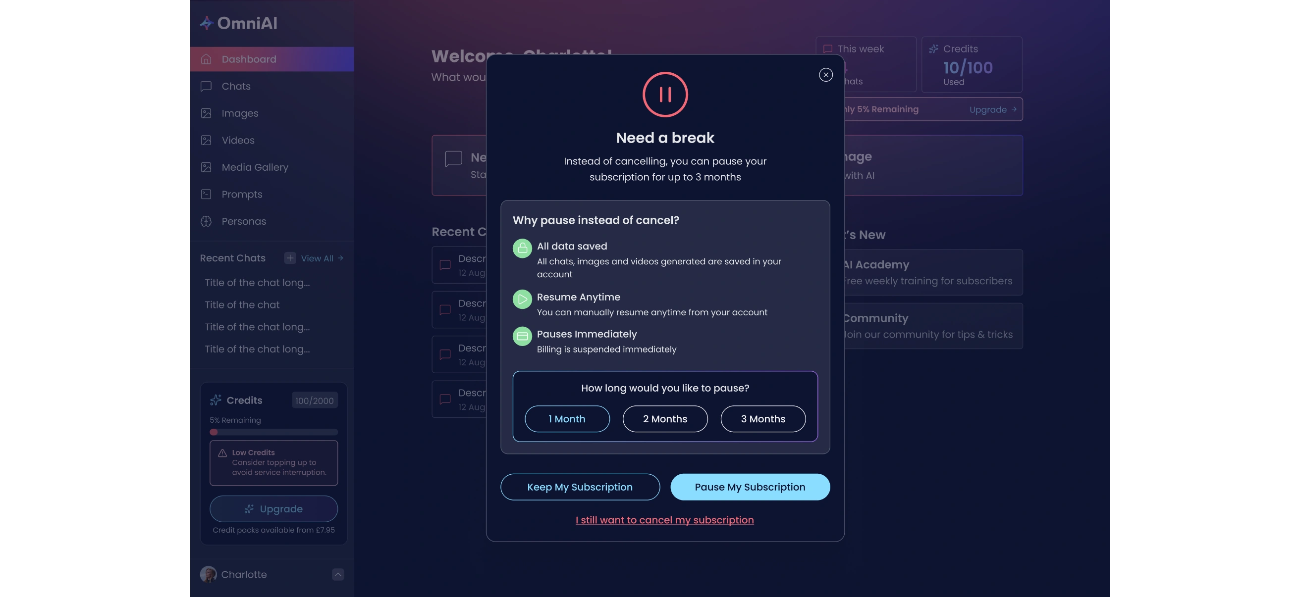
Designing Omni AI's cancellation flow so leaving isn't a dead end, offering a pause, a reason-specific intervention, and a genuine understanding of why someone wants to go, before asking them to confirm.
The Challenge
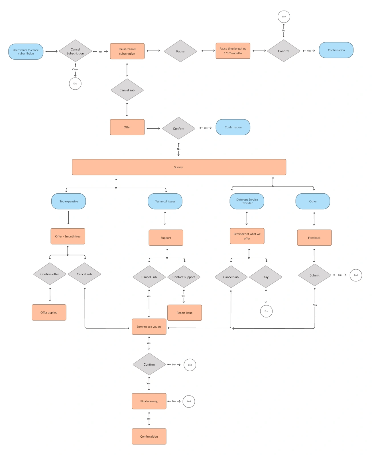
A single 'are you sure you want to cancel' screen treats every reason for leaving the same way, someone who thinks it's too expensive needs a different response to someone hitting a technical problem, or someone comparing Omni AI against another tool. Getting this wrong either annoys people trying to leave with pushy, irrelevant offers, or misses a genuine chance to solve the actual problem and keep them.
What We Did
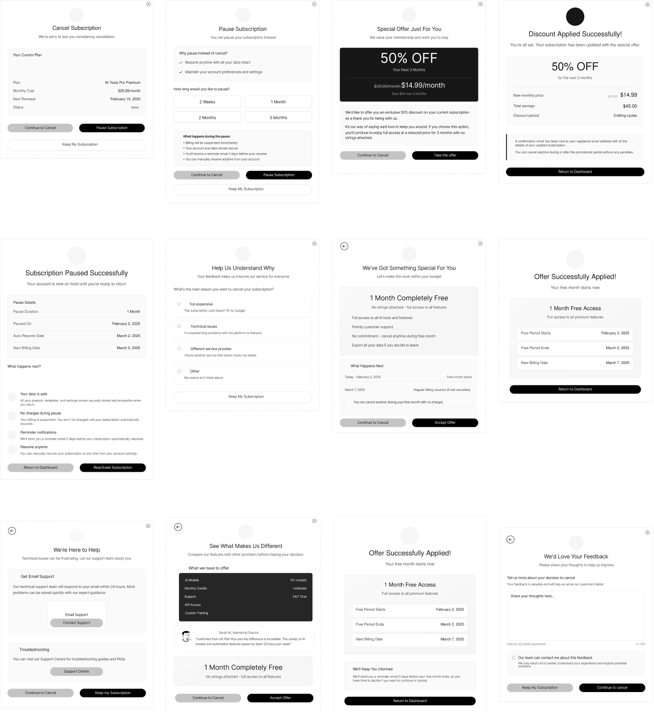
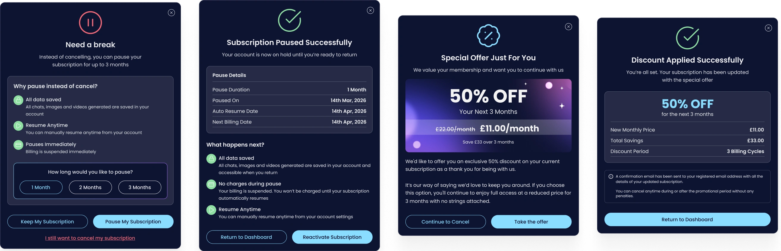
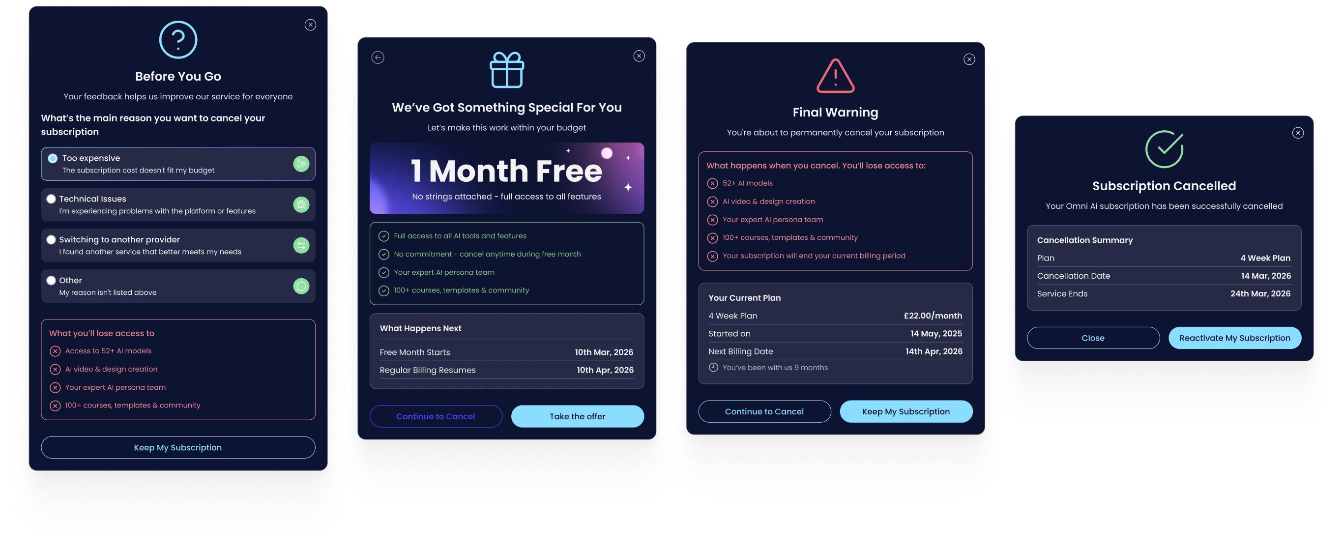
I designed the full flow end to end, working with the Product Owner and an engineer. Before cancellation is even on the table, users are offered a pause instead, keeping their data intact and billing suspended immediately, with a clear explanation of why that might suit them better. If they still want to cancel, a short survey asks why, and the response branches into a specific intervention: a discount offer for cost concerns, a route into support for technical issues, a comparison of what Omni AI offers against switching providers, or an open feedback field for anything else. Every branch keeps 'Keep My Subscription' as the easy option throughout, and a final warning, listing exactly what they'll lose, sits before the last confirmation, so cancelling is always a clear, deliberate choice rather than something that happens by accident or under pressure.
The Solution
Someone cancelling for a reason Omni AI can actually address, cost, a bug, a missing feature, gets offered something relevant to that reason rather than a generic 'please stay' message. Someone who's made up their mind can still get through the flow quickly, nothing forces them to engage with an offer they don't want. The pause option in particular gives a real middle ground between staying and leaving for good.
Retention
+16%
Estimated improvement in user retention post-launch.
Iteration
-8%
Reduction in design iteration time thanks to the shared system.
Feature Set
-40%
Legacy features consolidated or removed in the refocus.
Key Deliverables
- Pause subscription flow, offered before cancellation, with duration selection and clear data/billing reassurance
- Cancellation reason survey with four branching paths
- Reason-specific interventions: discount offer, support routing, competitor comparison, feedback capture
- Final warning screen detailing exactly what's lost on cancellation
- Confirmation and reactivation screens for both paused and cancelled states
Retrospective
Branching the intervention by cancellation reason, rather than offering the same generic discount to everyone, meant the flow could actually address why someone was leaving instead of guessing. The pause option mattered more than I expected going in, it gives people an option that isn't binary, stay or go, which a lot of cancellation flows don't offer at all.
If I ran this again, I'd want to track which branch each interventions actually saved a subscription, rather than treating all four as equally effective without any data to back that up.