Adzooma
A marketing site that matches the product
- Role & Position
- Senior Designer
- Services
- Web design, Content design, UX/UI
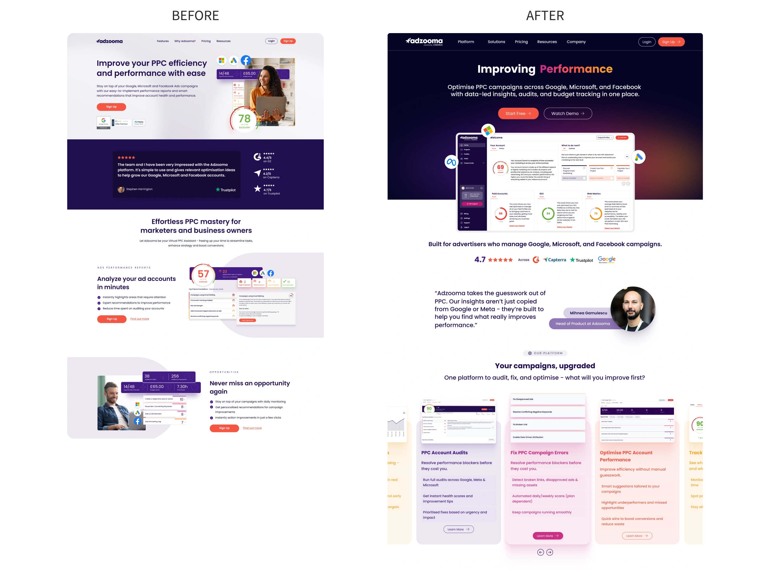
A full rebuild of adzooma.com, from the homepage through every role-based landing page, feature page and pricing page, closing the gap between the marketing promise and the actual product, and repositioning Adzooma within the ClickTech family.
The Challenge
The old site treated every visitor the same, one generic pitch regardless of whether they were an agency managing client accounts, a startup with no PPC experience, or an eCommerce brand chasing ROAS. It also no longer reflected what the product had become after the platform redesign, or Adzooma's position as part of the ClickTech family rather than a standalone tool. Prospects landing on the site got a weaker, less specific promise than the product could actually deliver.
What We Did
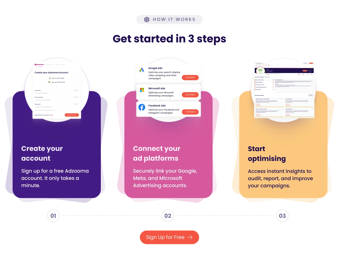
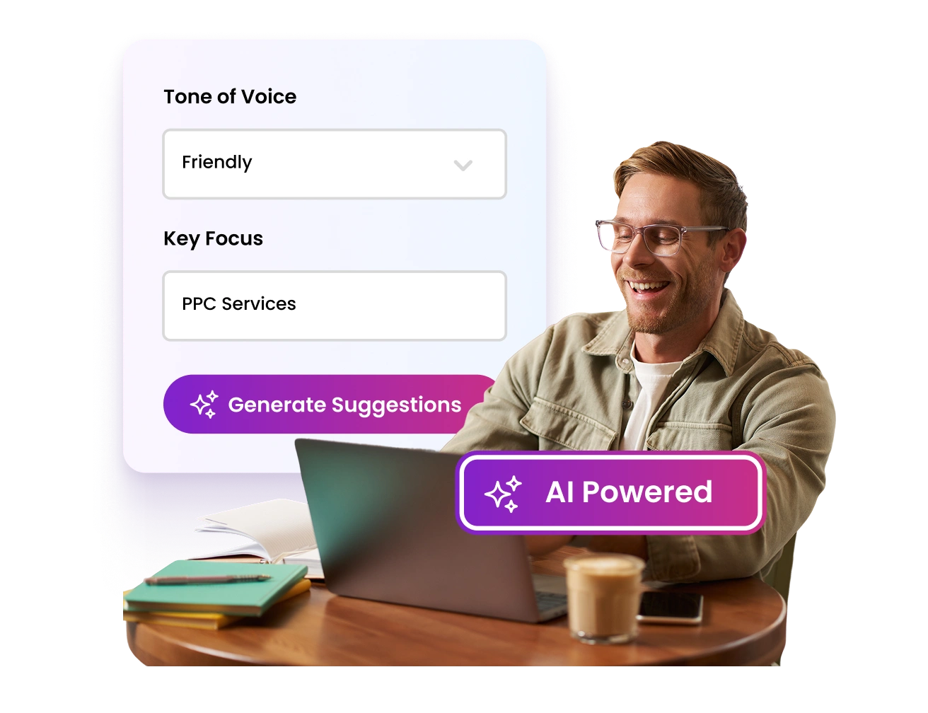
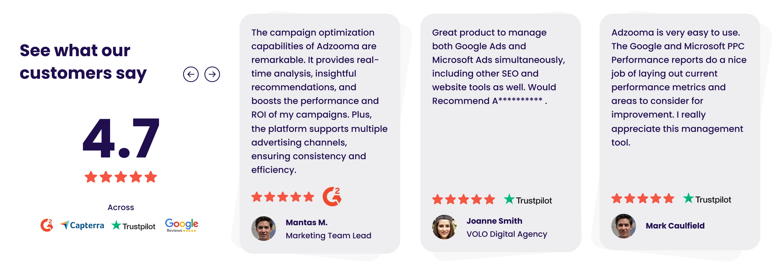
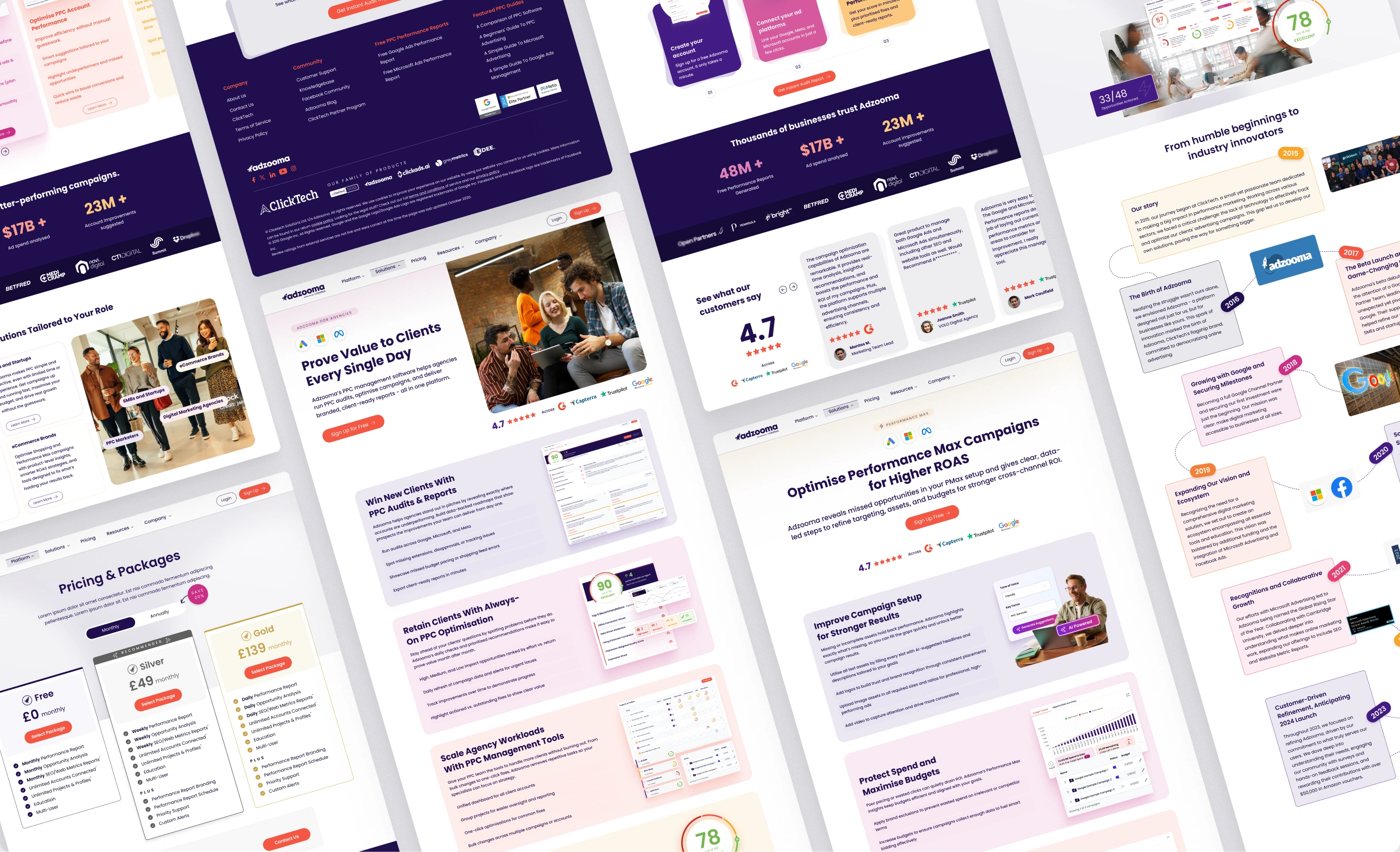
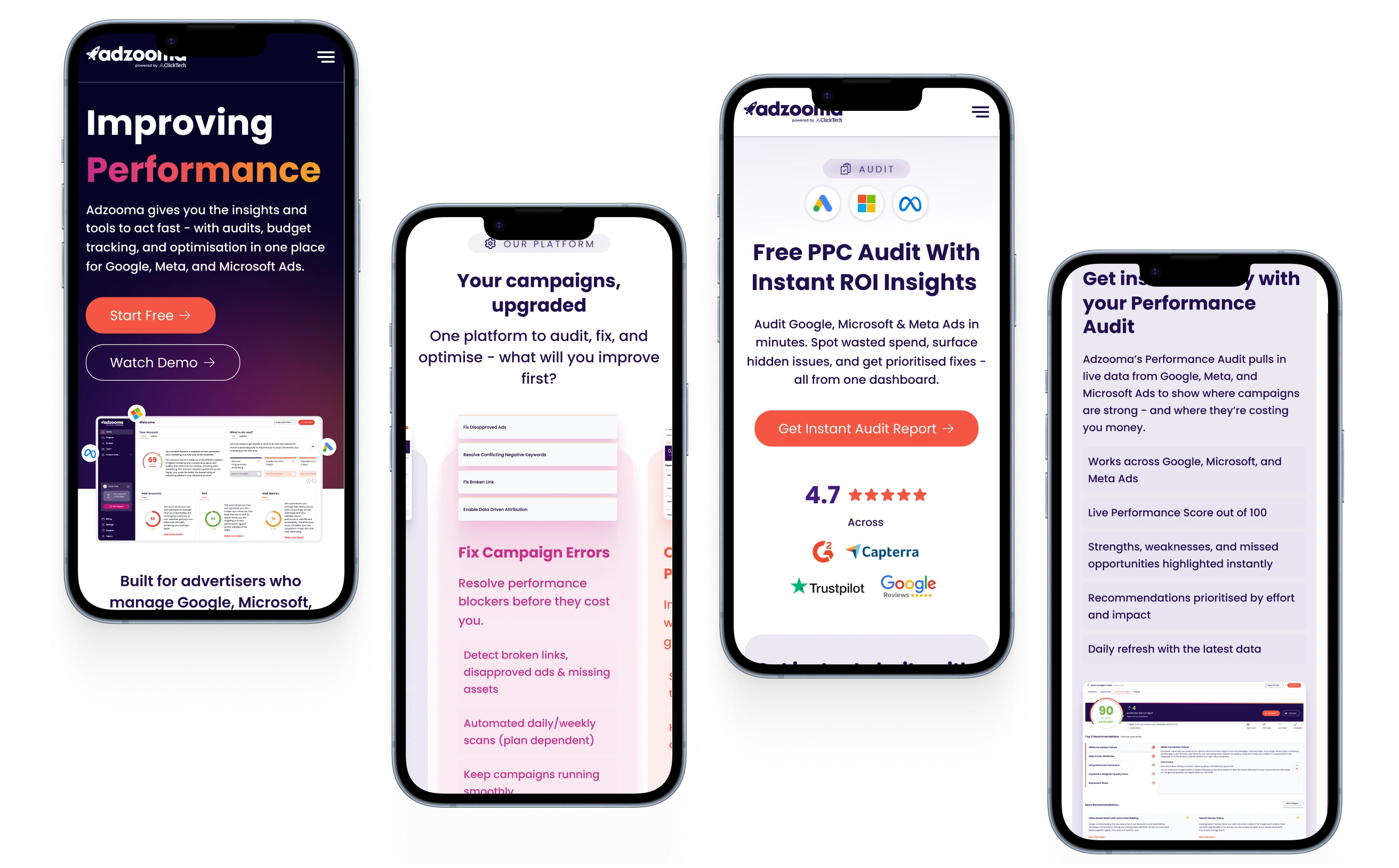
I rebuilt the site from the ground up, working with the Marketing Manager on positioning and messaging and an outsourced development team on the build. Rather than one homepage trying to speak to everyone, the new structure gives agencies, SMBs and startups, and eCommerce brands their own landing pages, each speaking to what that audience actually cares about. Feature pages break out specific capabilities like PPC audits, campaign error fixes and Performance Max optimisation, and an AI-powered ad copy generator gives prospects a genuine reason to engage with the tool before signing up, not just read about it. I designed the full site end to end, including pricing, a company story and timeline page, testimonials, and full responsive layouts across mobile.
Brand Guidelines
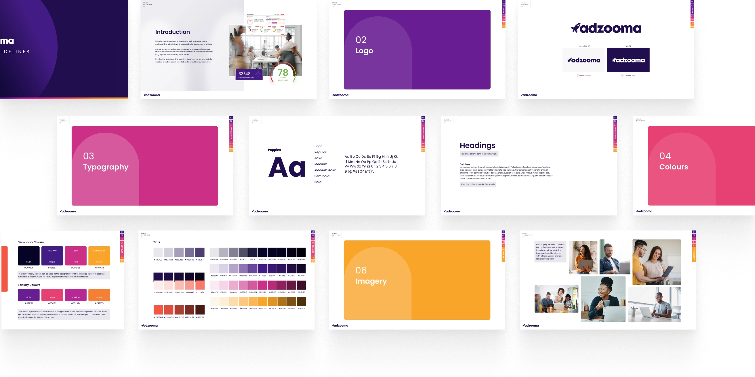
Alongside the site, I built a full brand guidelines deck solo, covering logo usage, typography and a colour system with primary, secondary and tertiary palettes. The secondary and tertiary colours aren't decorative, they carry the same meaning as the score categories inside the product itself: purple for Paid Ads, pink for SEO, yellow for Web Metrics, and a tertiary set tied to recommendation types like Improve Performance and Reduce Wasted Spend. That link means the visual language on the marketing site and inside the product are the same system, not two brands that happen to share a logo.
The Solution
Visitors now land on messaging built for who they actually are, backed by a documented visual system that carries through from the marketing site into the product itself. The AI ad copy tool gives prospects something to try immediately rather than a page of claims to take on faith.
Retention
+16%
Estimated improvement in user retention post-launch.
Iteration
-8%
Reduction in design iteration time thanks to the shared system.
Feature Set
-40%
Legacy features consolidated or removed in the refocus.
Key Deliverables
- Homepage redesign with clear, audience-led value proposition
- Role-based landing pages for agencies, SMBs/startups, and eCommerce brands
- Feature pages: PPC audits, campaign error fixes, Performance Max optimisation
- Pricing page, company story/timeline page, and testimonials
- Full mobile-responsive designs across the site
- Brand guidelines deck: logo, typography, colour system, imagery direction
Retrospective
Tying the marketing site's colour system directly to the product's own scoring categories was a small decision that did a lot of work, it meant consistency wasn't just a visual nicety, it reinforced the product's logic before someone had even signed up.
If I ran this again, I'd want the role-based landing pages user-tested before launch rather than after, we were designing for three quite different audiences on assumption alone.