ClickTech Hub
One system, every theme: ClickTech Hub's design system
- Role & Position
- Senior Designer
- Services
- Systems, Documentation, UX/UI
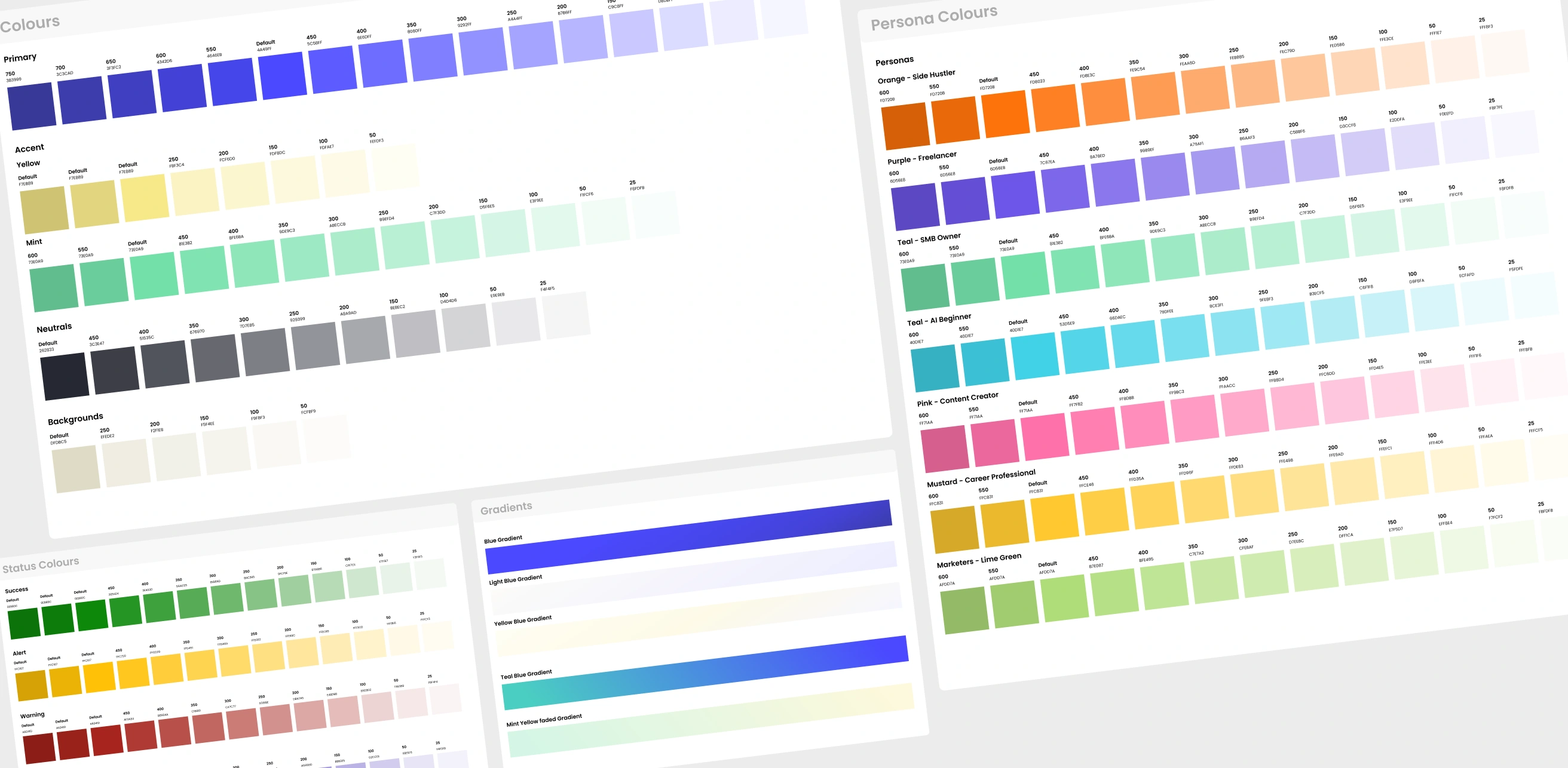
A design system built from the ground up for ClickTech Hub: a shared component library that speeds up design across multiple designers, supports dark mode and persona theme switching, and keeps design and engineering aligned at build.
The Challenge
With multiple designers working across ClickTech Hub, consistency was hard to maintain and every new screen meant rebuilding the same patterns from scratch. On top of that, the product needed to support dark mode and persona-based theme colours, which a screen-by-screen approach couldn't handle without becoming unmanageable. There was no shared system tying design decisions to what engineering actually built, so consistency broke down at handoff too.
What We Did
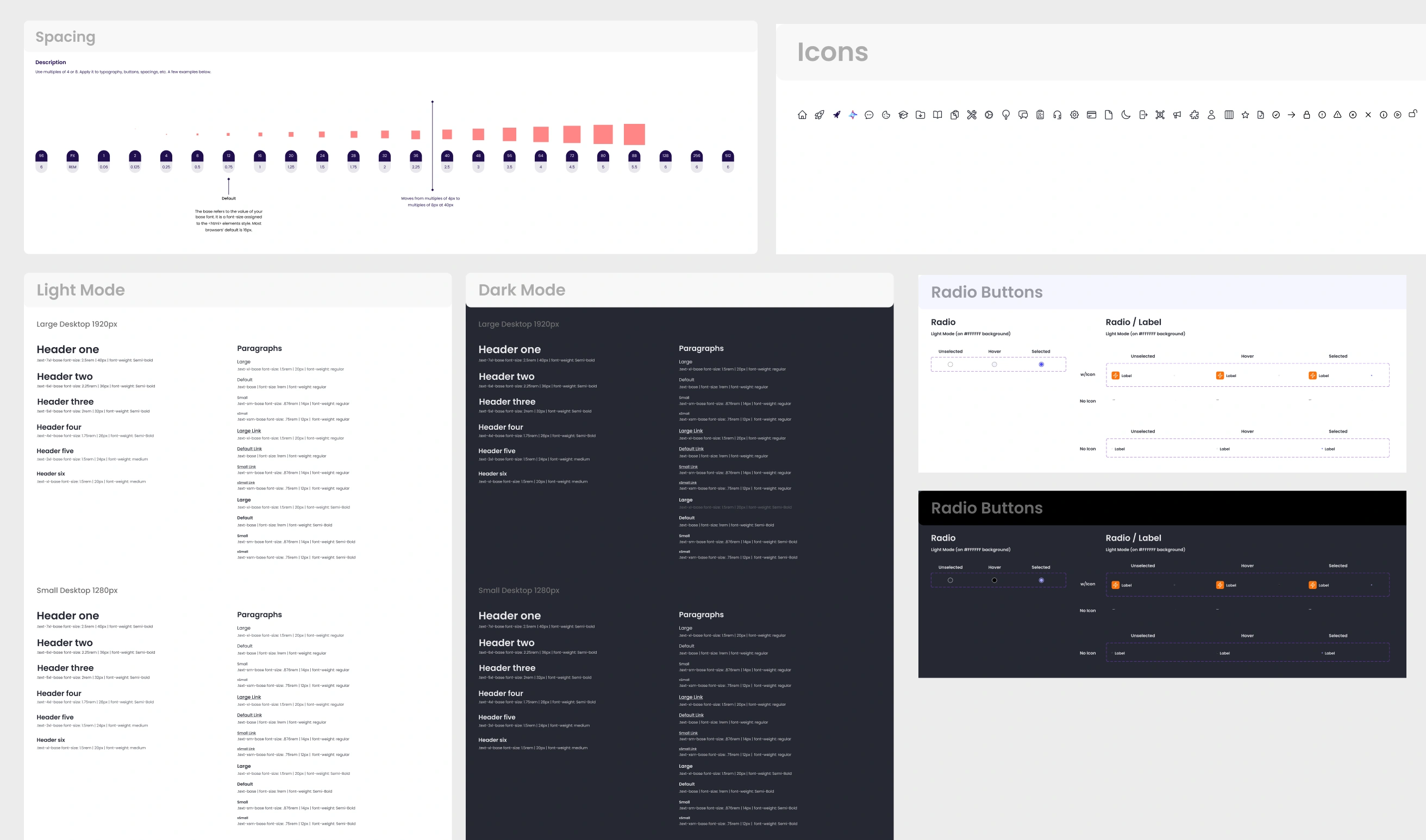
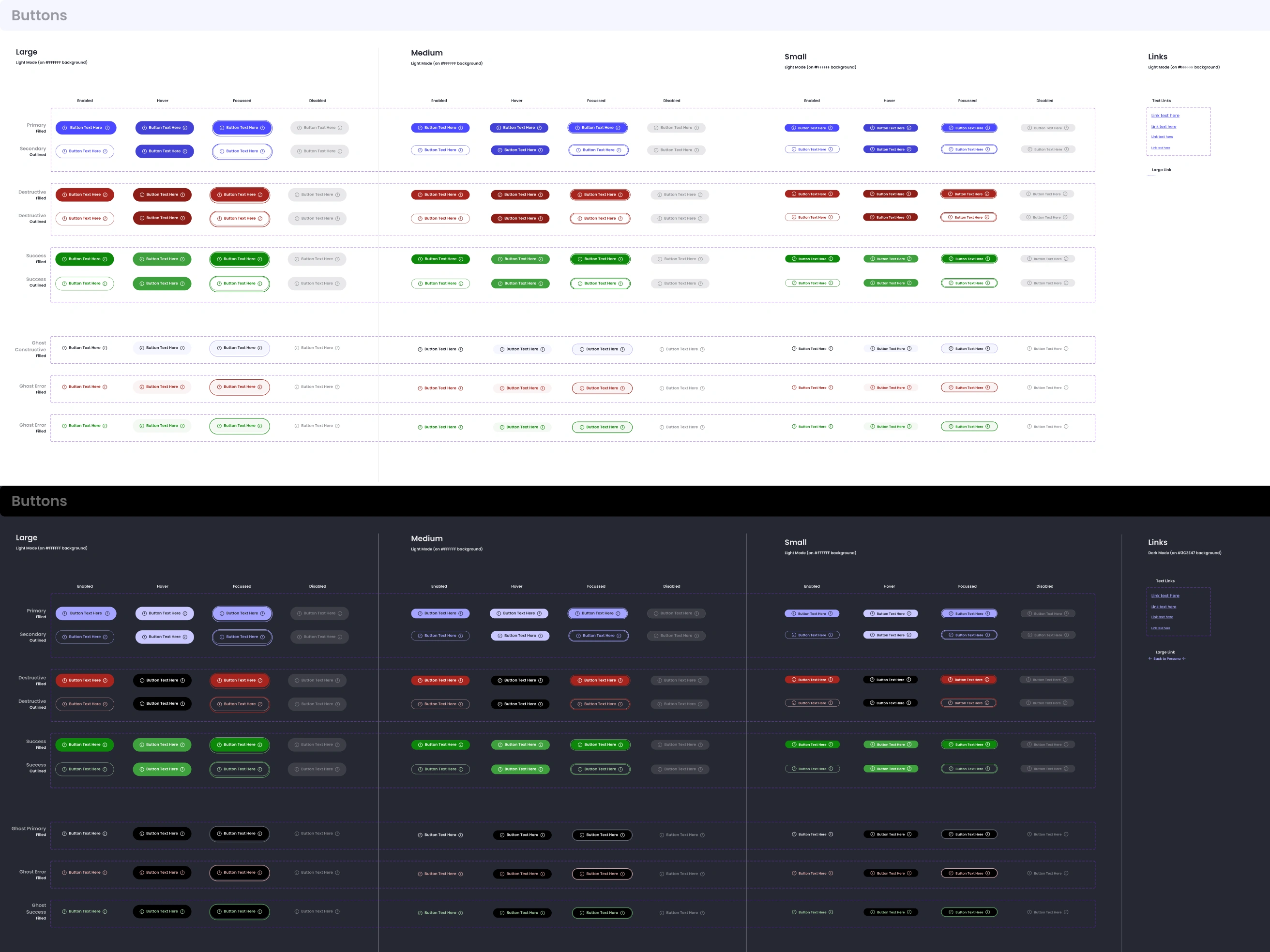
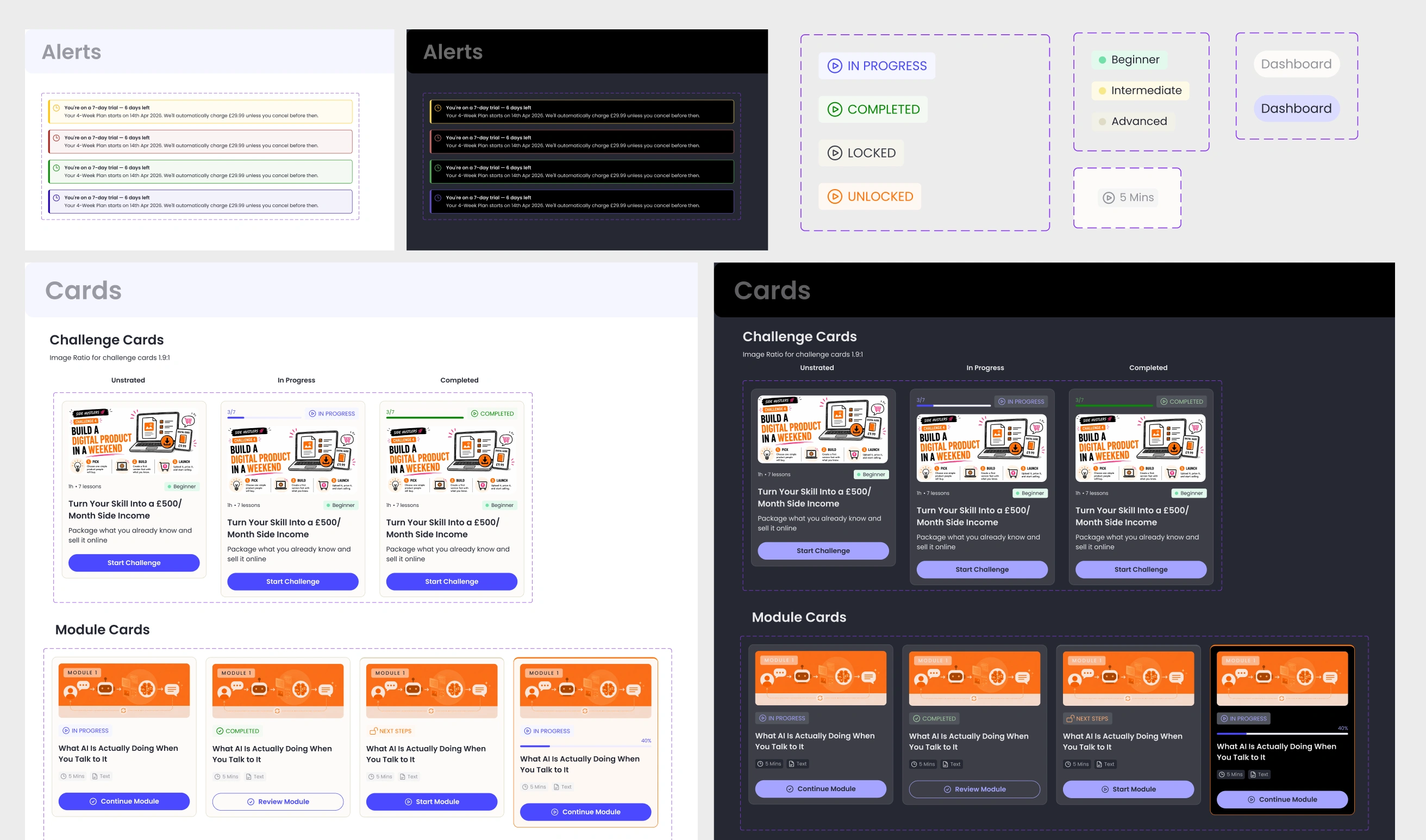
I built the design system from the ground up on my own: tokens, components, mode switching and theme switching, all structured so multiple designers could work from one shared source rather than rebuilding patterns per screen. Dark mode and persona theme colours were handled at the token level rather than screen by screen, and I worked closely with engineering to make sure what was defined in the system matched what got built.
The Solution
Designers now work from a shared component library built on tokens, with dark mode and persona theme colours handled at the token level instead of reworked each time. Because the system was defined with engineering input, what ships matches what's designed, closing the gap that used to open up at handoff.
Retention
+16%
Estimated improvement in user retention post-launch.
Iteration
-8%
Reduction in design iteration time thanks to the shared system.
Feature Set
-40%
Legacy features consolidated or removed in the refocus.
Key Deliverables
- Token architecture underpinning the system, colour, theme and mode included
- Component library built on those tokens
- Dark mode and persona theme switching, handled at the system level
- Design-to-engineering alignment, keeping shipped product consistent with design
Retrospective
Building the theming into the system itself, rather than solving dark mode and persona colours screen by screen, was the decision that made everything else scale. It meant new screens and new personas didn't mean new design work from zero.
If I ran this again, I'd want to involve engineering even earlier in defining how the tokens were structured, so the handoff was built into the foundations rather than aligned afterwards.