ClickTech Hub
Unifying a fragmented platform experience
- Role & Position
- Senior Designer
- Services
- Product design, UX/UI
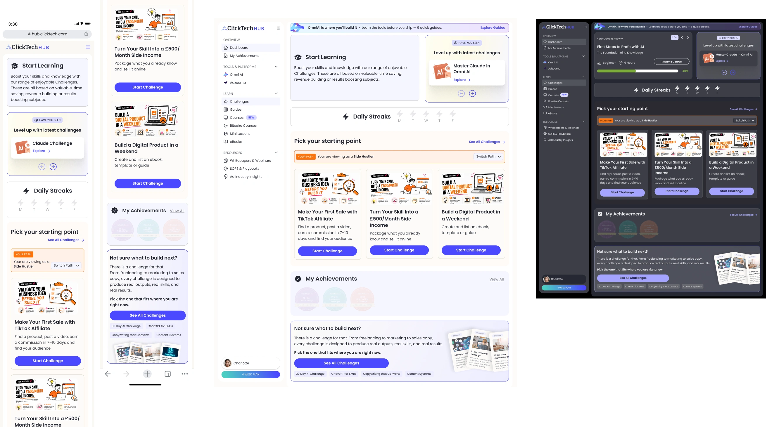
Designing ClickTech Hub's core product experience from the ground up: the dashboard, persona overview and Challenge screens, built around guiding members through the platform rather than leaving them to find their own way.
The Challenge
ClickTech Hub set out to package courses, AI tools and coaching into one learning platform, but the core product experience didn't exist yet. The brief wasn't to fix broken engagement. It was to design for it from the start, in a space where the obvious default, a flat library of content, tends to leave users with no clear starting point and nothing pulling them back.
What We Did
I designed the core product experience from scratch, mobile first: the dashboard, the Challenge format across video and text, and the wider platform structure, working closely with the Head of Product and engineering team to shape scope and iterate as real usage and feedback came in. The early focus was on getting the fundamentals right: a clear content structure and a Challenge experience that worked across both formats, before layering in more targeted ways to guide users through it.
Personas
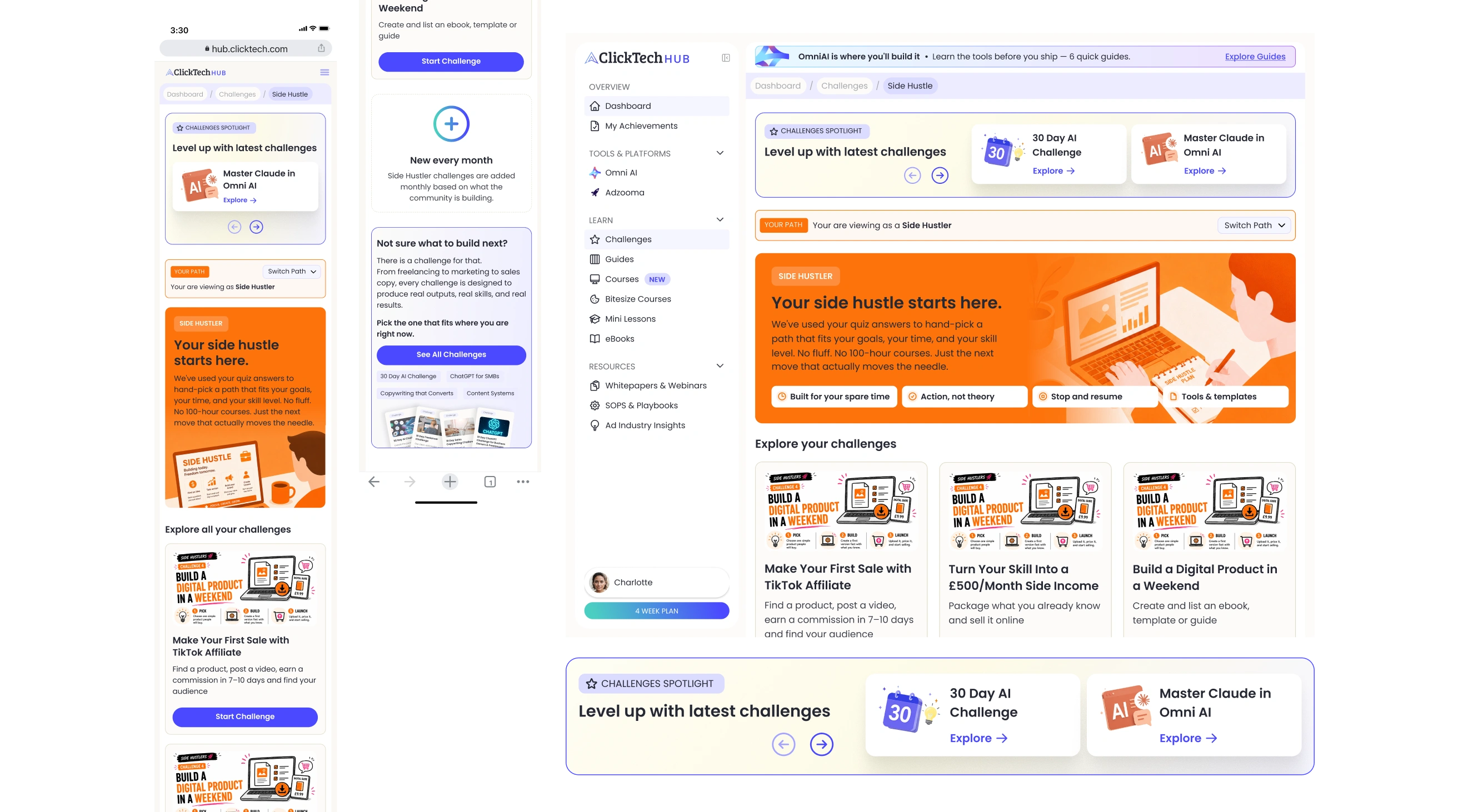
Personas were introduced after data showed users were unsure where to start or what they'd get out of the platform. Each persona builds a personalised learning path, generated from the answers users give in the initial sales funnel questions, and surfaces specific challenges matched to their needs rather than the full course library. Since introducing this flow, engagement has improved and more users are returning to the platform.

The Content
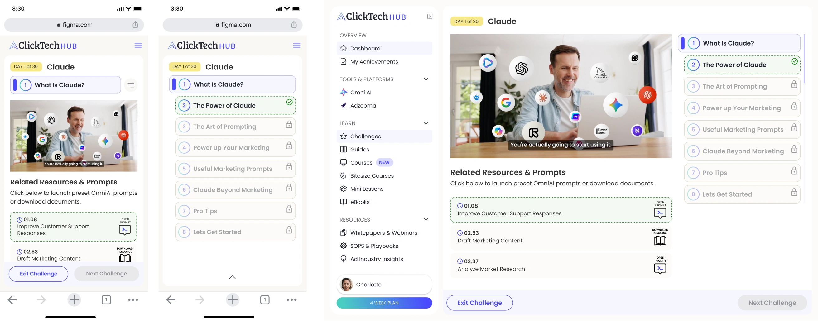
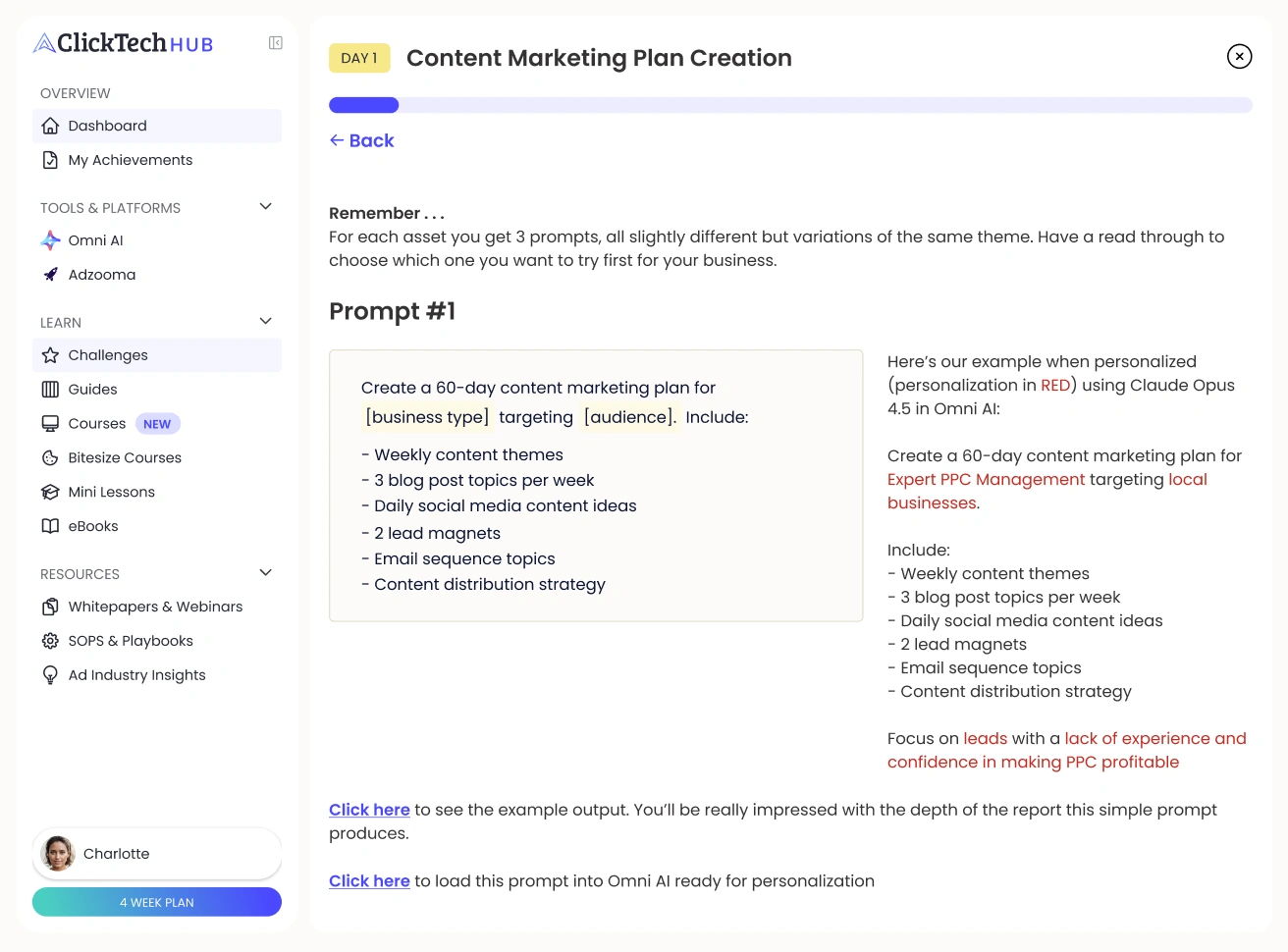
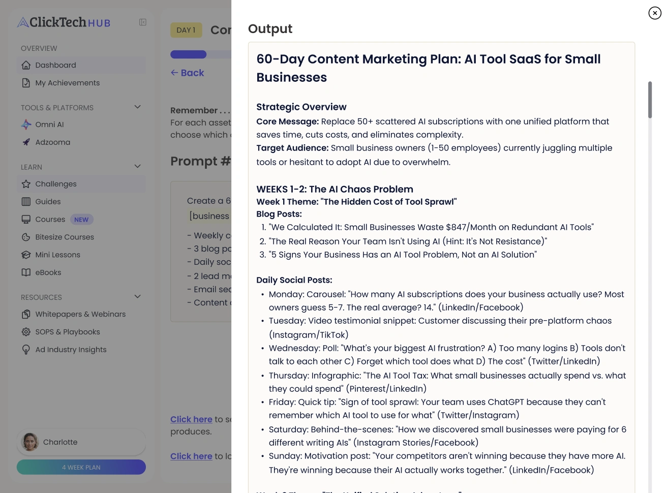
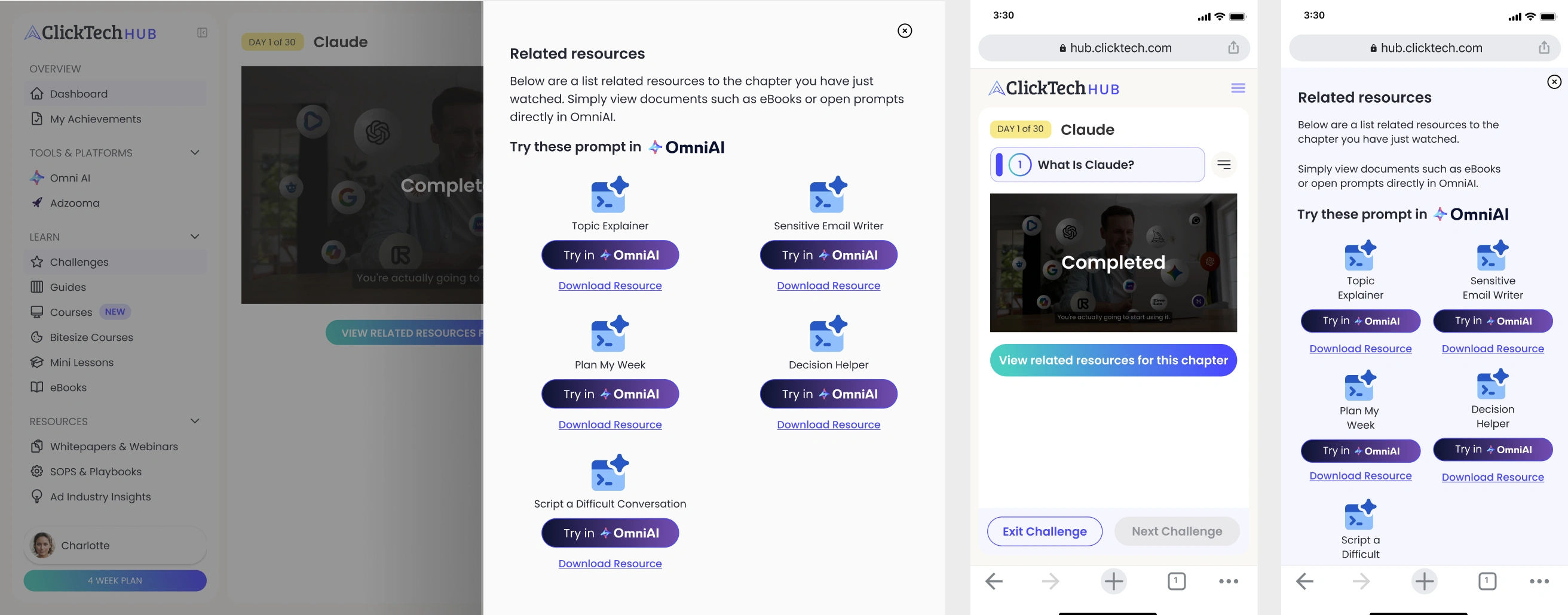
Challenge and course content is split between video and text, and each needed its own interaction design. Video started as a single, full-length format, but usage showed users weren't completing it, so this was broken down into shorter chapters instead. Resources unlock after each chapter, letting users test what they've learnt as they go rather than at the end. Text content follows a similar principle: broken into small, easy-to-digest slides that users progress through, ending in a challenge to complete before they earn their certificate.
The Solution
On landing, users see a dashboard shaped by their persona rather than a wall of unsorted content. The persona overview page sets expectations for what's ahead and why it's relevant, and that same guided structure carries through into the Challenge screens, available in video or text depending on how someone prefers to learn.
Retention
+16%
Estimated improvement in user retention post-launch.
Iteration
-8%
Reduction in design iteration time thanks to the shared system.
Feature Set
-40%
Legacy features consolidated or removed in the refocus.
Key Deliverables
- Dashboard: persona-led entry point designed as the platform's core landing experience
- Persona overview screen: new page establishing each user's guided path through the Hub
- Challenge experience (video + text): learning screens designed across both formats
Retrospective
The redesign taught me how much a coherent product story is worth. When the marketing site, the sign-up flow and the dashboard all speak the same visual language, users stop noticing the seams — and that quiet consistency does most of the work.
If I ran this again I would embed the design system work even earlier. Building components alongside the flows, rather than after them, would have compressed the last two months of the project into weeks.